The golden rule
The golden rule is: do your best and I’ll figure out the rest.
There are some guidelines here that will make my life easier when converting your content to get it on the website. However, what is most important is that you are able to get the information from your head down on paper. If trying to follow these guidelines is too overwhelming, don’t worry. Just ignore them and I’ll figure out how to sort it out.
Write using whatever tool is most comfortable for you. Word document. Google docs. Plaintext. Markdown. HTML. RTF and PDF are difficult formats for me to work with. But whatever you have, I’ll figure out how to translate it to present on the website.
Pick headings based on structure not aesthetics
If you are using the headings feature in whatever format you have chosen, pick the heading level based on what makes sense for the structure of the document, not what looks aesthetically pleasing using the particular theme you’re looking at the document with. When it gets converted to the website, the headings will look different anyway.
Imagine your headings are being turned into a table of contents. If you had a heading called “Adding items” with subsections “Adding round items” and “Adding square items”, you would expect the subsections to be one level under the “Adding items” heading.

Consistent heading structure is important for accessibility, so I will correct anything that looks like it might be an inconsistent structure.
Limit the number of nested headings
More of a general writing tip, but it is often a good idea to try and limit how nested your headings get. If you find you have gotten to heading 4 or beyond, try just lifting them up a level. You might be surprised that it is actually easier to follow.
Prefer a single column layout
Fancy multi-column layouts are certainly possible, but they are harder than a simple single-column layout.
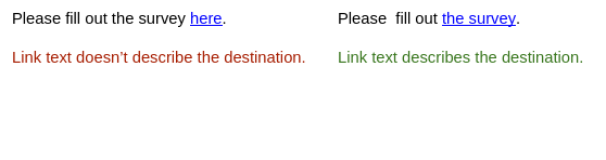
Link text should describe it’s destination
The text of a link should describe where it will take you. When using a screen reader, users can cycle through the links on a page to select which link to follow. When they do so, the screen reader will read out just the text of the link, not the surrounding text. If the link text just says “here”, they will have to ask the screen reader to back up and read the paragraph again to remember what “here” is referring to.
Provide alt text for images
If you have images, it is useful if you can provide the alt text. This is important for accessibility. Screen readers will read out the alt text for an image. The alt text should describe the point the image is trying to convey to sighted users.
If you don’t provide any alt text, I’ll try and write some up for you.